There are, apparently, great decisions being made, behind the scenes in corporate boardrooms. We’re not talking about whether to maximize shareholder profits over social good, or hiding the latest instance of embezzlement or child labor use. We’re talking about The Color Of The Year. Now, I’ve seen, year after year, when Pantone announces their color and all my design-soaked friends go into a frenzy. Apparently all of them have clients who redecorate, repaint, or are reborn once a year in the official Pantone color, so as not to be left behind. The Joneses and all that. This year, I gather, many are feeling a trifle miffed, as Pantone has selected as its 2020 CotY…

… Classic Blue. This, I gather is “uninspired”. Yet, no doubt, they will still rush to slather paint across walls or trimmings in this venerable color. But, who is to say that Pantone is the be all and end all of color choice? Every paint company out there chooses their own – and one, this year, Valspar, has offered up a palette of a dozen colors, refusing to commit to just one, so we’re going to discard them on the waste heap of poor choices.
Staying in the blue realm…

…Porter Paints, or, I gather it’s more commonly referred to as “PPG”, has chosen Chinese Porcelain as a more greyish shade of blue. And…

…the well known Sherwin Williams has headed full tilt into the darker ranges with Naval.
But what if you aren’t feeling blue? Perhaps something leaning green. Starting with the very earth-toned…

…Back to Nature from Behr, which to me looks more khaki or tan than green, but apparently just shades into the verdant world. Or something light and springy…
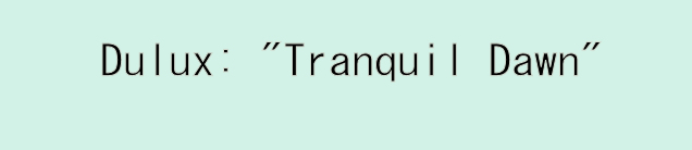
…like Tranquil Dawn from Dulux, or…

…Dunn Edwards’ Minty Fresh. But perhaps, as I might, you prefer something with a bit more oomph…

…I quite like the Dark Seafoam Green from Toptal, and I appreciate that they haven’t gone all silly in the head with naming it. I mean, much as I like this darker shade…

…the apparently newly introduced Adeline from Graham & Brown – Adeline???? Really? Who named this and do they still have their job? Then again, I do like the color. Perhaps as a window “treatment”?
But, this is all very blue and green, and I’m sure there are those who want to go to the other side of the color palette, and not to despair, two companies have gone all rosy glow on us this year…

…coming in with First Light from Benjamin Moore, and…

…the sort of skin-toned pink of Romance from HGTV Home, which is a division of Sherwin Williams, up above, contemplating their naval….
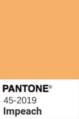
So many choices. So important. I almost want to bring back the meme of the 2019 Pantone color of Impeach (not a real thing)…
…but since I predict that’s gonna turn out to be a disaster, maybe not.
Be First to Comment